
We are Bright Designlab.
Our interior design is authentic and approachable. Our process is rigorous and organized. We are focused on the details. After all, that’s what makes up the bigger picture.
Tell us your story. We will listen. We will ask questions and collaborate with you to land on a solution that will not only attain your goals, but hopefully delight you.
We seek clients and projects that center on making a positive difference in the world. Working across residential, restaurant, hospitality and retail spaces in the Portland, Oregon area and across the globe. Each space is designed to be truly lived in, with the intention to make life easier and unquestionably more beautiful.
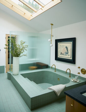
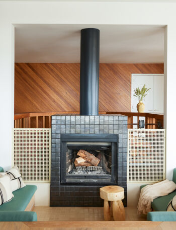
The team of Green Gables and Bright Designlab were asked to completely reimagine the interior of this home built in 1954, which included a full architectural finish package. The first priority was to refine the layout taking advantage of the expansive views to the West Hills, which meant relocating a central staircase and a full reconfiguration of the Kitchen. The selected materials and muted palette were carefully considered to evoke an organic, modern aesthetic. In the Living Room, there were existing wood ceilings that we were able to repurpose in a contemporary way to complement the new design and preserve some original details in the home.
The clients requested a private Primary Bedroom with an en suite bath that would take advantage of the views. As part of the programming for four teenagers and frequent visits from parents, each of the additional five bedrooms now have en suite bathrooms as well. Every space throughout the house was designed with purpose, creating understated beauty and high-level function for this family of six.
It’s always a good sign when previous clients return for multiple collaborations. This one was a dream project, the kind that we always hope for. An extensive down to the studs remodel of a home where the previous owner resided for 40 years, and in dire need of resussitation. There are nods to the time capsule of the midcentury ranch while pushing the boundaries of design. Satruated color and texture create a space that embraces you upon entry. Rich color next to warm woods. An active call to the local trades to fabricate and showcase brasswork (Boy Boy), cabinetry (Maple Key LLC, Master Furnituremakers) and the tried and true craftmanship of The Works general contractor.
Privately located on the coveted street of Greenleaf Court, this gorgeous 1930’s home was full of architectural charm and waiting for a Bright refresh. The client originally tasked the Bright team to fully furnish their first home in Portland after relocating from Chicago. They explained that they never had investment pieces in their home and wanted us to find furniture and artwork that would resonate with them for years to come. The house also called for an overall refresh to elevate the space and complement the new furniture.
We developed a new paint palette for the interiors, highlighting the architectural moldings; integrated custom built-in shelving, seating areas, and fully reimagined the fireplace. The Powder Bath refresh was the final bonus update.
Interior design and renovation created to elevate the interior and exterior of an architect-designed home in a hidden area of Portland’s NW hills. The design is comfortable yet elegant, infusing the family’s acquired treasures from world travels throughout the home (canoes and totems included!), resulting in a playful and meaningful interior. The exterior was re-imagined to integrate with the surrounding forest, and lead into trails landscaped throughout the 50 acre property.
A return client came to us after finding this 1935 Tudor gem on a quiet street in Portland SW Hills. While the house had classic architectural charm, it was layered in decades of miscellaneous updates, turning it into a bit of a diamond in the rough. In Bright Designlab’s renovation, we chose finishes and fixtures that nod to the original era of the home, while mixing in more dynamic design-forward materials. The result is a sophisticated space that was tailored to the client’s needs, and a reinvigorated Tudor beauty.
The Petes Mountain Lodge home is a beautiful country house perched on 7 acres of sprawling fields and trees. This home, built in 2001, created a unique challenge to blend a modern lodge vibe with the existing architectural style – strong rustic wood elements that the client wanted to preserve, and a many areas that were in great need of a design overhaul. With materials chosen for durability and longevity, we landed on a design that showcases the serene landscape and creates a symbiotic indoor/outdoor relationship.
On the interior, all of the existing pine doors and trim were preserved. The kitchen configuration was reimagined to introduce a more productive flow with an open layout. This also created room for more storage to meet the growing family’s needs. We also designed a full reconfiguration of the Primary Bath to gain both function and unobstructed views out to the property.
The Nob Hill Goth project is a beautiful historic Victorian in NW Portland. This home, rumored to be on on of the Portlandia episodes fell into our lap in mid 2021. What started as a collaborative furniture refresh to make the design language more cohesive, turned into a full addition for a dream Kitchen + Powder room for the clients. By merely extending the kitchen six feet in two directions, we were able to create a large kitchen with expansive counters in Calacatta Viola, a giant island and a full wall of doors that open entirely to the outdoor space. The design language was carried through in lush full-spectrum paint colors by Farrow & Ball, and an ecclectic furniture package with vintage finds, client’s own artwork and curated pieces made by artisans such as Brazilain Designer Juliana Vasconcelos and small Irish funiture maker Orior.
In this remarkable transformation of a historical 1912 Craftsman house in the Ladd’s Addition, the heart of the home was reimagined with the kitchen now occupying the space where the living room once stood. In order to gain the function and space that this modern family desired, this strategic relocation optimized the flow of the interior and infused the home with a new sense of purpose and grace. The kitchen, traditionally a place of gathering, now basks in the generous proportions featuring a 55″ range and a custom-designed island that seats the entire family.
A remodel for a home of this era requires a delicate balance between preserving historical integrity and introducing modern comforts. The client expressed interest in having a space that felt more delicate and design-forward to balance the stout architectural style of a craftsman home. Soft hues, floral motifs, and subtle arches were thoughtfully integrated into the design, elevating each space. Arched niches in the kitchen display an array of meaningful books, photographs, and collected items; a marbled vanity in the Primary evokes a romantic quality like that of a classic film while being so practical at the same time. While many of the original built-in cabinetry and leaded glass were preserved during the design development, every corner of the home was reimagined to create a contemporary design that respects the character of the home, adding function and value along with the general feeling that it may have always been that way.
Our clients bought a home on a tree-lined street in North Portland’s Overlook neighborhood that had been comfortably lived in and not renovated since sometime in the 1940’s or maybe the 70’s… hard to discern, but you get the picture.
The young couple hired Bright Besignlab to help collaborate on a full home overhaul – kitchen planning and design, guest bath design and remodel, and designing the addition of a new master bath + closet suite, as well as overall color palette throughout.
The finished product is an exciting, playful yet sophisticated array of pattern, color and texture – juxtaposing modern finishes and old world techniques. The kitchen design includes blue azure concrete tiles from Ann Sacks, Bright Designlab detailing on custom washed gray oak cabinets and waterfall of pentalquartz with warm, winding, walnut floating shelves. and glossy white upper European style cabinets. Brass hardware and beat lights provide a sparkling warmth and light.
Our clients came to us with a playful, bright-eyed energy that we poured into our overall concept, then drove every detail to encompass this verve into their space. Our challenge in this project was the eclectic mix of existing traditional furniture pieces and the desire to intertwine more modern, design-forward pieces. We collaborated with some of our favorite contemporary designers on the lighting and furniture for this project; and also found a variety of vintage pieces to round out this concept of a layered history – pieces like the Viggo Boesen sofa in the Primary Bedroom, and the 1970’s Ingo Maurer “Uchiwa” pendant in the Dining Room. This was an amazing opportunity to design some custom furniture (i.e. the dining table and built-in sofa) and work in a mix of chronicled and modern design details.
Patterns throughout, and the materials and art evoke a worldly feel of this well-traveled family, soft textures pulled in the luxurious sensibility we all desire, the vibrant colors are a reflection of the clients themselves – playfulness meets sophistication.
Interior design and renovation created to elevate the interior and exterior of an architect-designed home in a hidden area of Portland’s NW hills. The design is comfortable yet elegant, infusing the family’s acquired treasures from world travels throughout the home (canoes and totems included!), resulting in a playful and meaningful interior. The exterior was re-imagined to integrate with the surrounding forest, and lead into trails landscaped throughout the 50 acre property.
v5.0
When you register as a free Member of the Remodelista family of websites (Remodelista, Gardenista, and The Organized Home), you gain access to all current posts plus 10 archived posts per month, our internal bookmarking tool, and the community bulletin board.
Member benefits include:
For $5/month ($59.99 paid annually) you'll enjoy unlimited, ad-free access to Remodelista, Gardenista, and The Organized Home and all the benefits of Membership.
Subscriber benefits include:
For $5/month ($59.99 paid annually) you'll enjoy unlimited, ad-free access to Remodelista, Gardenista, and The Organized Home and all the benefits of Membership.
Subscriber benefits include:
Benefits include:
For $5/month ($59.99 paid annually) you'll enjoy unlimited, ad-free access to Remodelista, Gardenista, and The Organized Home and all the benefits of Membership.
Subscriber benefits include:
When you register as a free Member of the Remodelista family of websites (Remodelista, Gardenista, and The Organized Home), you gain access to all current posts plus 10 archived posts per month, our internal bookmarking tool, and the community bulletin board.
Member benefits include:
If at any time you want to become a Subscriber and enjoy unlimited, ad-free access to all our content, just go to the My Account link and choose Subscribe.
Advertising funds our work at Gardenista and helps us provide you with a daily dose of garden inspiration & design. We hope you’ll consider disabling your adblocker for Gardenista so we can continue our mission: a well-designed garden for all.
Thank you for your support.