Icon - Arrow LeftAn icon we use to indicate a rightwards action. Icon - Arrow RightAn icon we use to indicate a leftwards action. Icon - External LinkAn icon we use to indicate a button link is external. Icon - MessageThe icon we use to represent an email action. Icon - Down ChevronUsed to indicate a dropdown. Icon - CloseUsed to indicate a close action. Icon - Dropdown ArrowUsed to indicate a dropdown. Icon - Location PinUsed to showcase a location on a map. Icon - Zoom OutUsed to indicate a zoom out action on a map. Icon - Zoom InUsed to indicate a zoom in action on a map. Icon - SearchUsed to indicate a search action. Icon - EmailUsed to indicate an emai action. Icon - FacebookFacebooks brand mark for use in social sharing icons. flipboard Icon - InstagramInstagrams brand mark for use in social sharing icons. Icon - PinterestPinterests brand mark for use in social sharing icons. Icon - TwitterTwitters brand mark for use in social sharing icons. Icon - Check MarkA check mark for checkbox buttons.
Search

Bunker Workshop

Philadelphia
Photo: Matt Delphenich

Regions Served

  • Boston & New England
  • New York City & Mid-Atlantic

Services Offered

Bunker Workshop was created by Chris Greenawalt in Boston, Massachusetts in 2009. The name Bunker Workshop was chosen as a nod to the firm’s location and intention. While the location has changed, the intention has not. Chris’ aim is to workshop with clients in order to provide personal, thoughtful design. He believes the best outcomes are achieved through good conversation, client observation, and communication. He will introduce you to a number of talented, hard-working local craftsman that will help you realize your project on time and within budget.

(Visited 1 times, 1 visits today)

Details

Contact

Owner

  • Chris Greenawalt

Locations

  • 956 North 5th Street
    Philadelphia, PA 19123

Featured Projects

Deblois

We knew it had potential. Corner unit with high ceilings. Some nice detailing. She was just neglected and we gave her some much needed attention. This is a small space so every square inch counts. We filled one wall up with white cabinetry and replaced a room-choking peninsula with a flow-friendly island. The bookcase becomes the focal point here. It is in contrast to everything else in the room. It has a texture (pattern) while every other surface is smooth. It is black when everything else is white. It creates a contrasting focal point in the room which helps give the illusion of receding in space.

(Visited 149 times, 1 visits today)
Photos: Matt Delphenich

Winter Hill

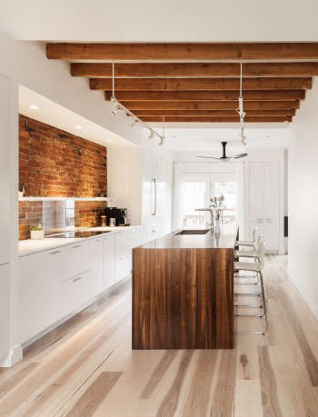
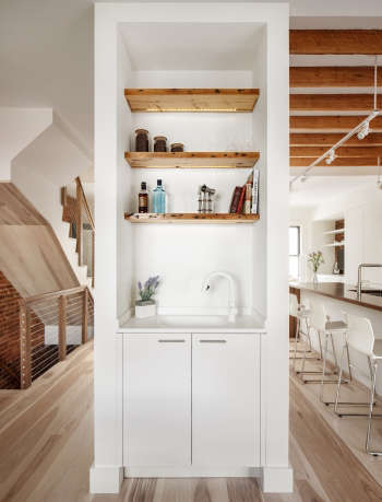
We recently completed an interior fit-out in the Somerville neighborhood of Boston. The first floor was completely gutted and reorganized to fit the needs of a young couple. The kitchen is now orientated along a beautiful exposed brick wall. The highlight of the kitchen space is a walnut island finely crafted by Grothouse. A built-in dining nook and bar now occupy the former kitchen area. Another well executed project by Beaudry Construction includes a new hickory stair with steel rail.

(Visited 149 times, 1 visits today)
Photos: Matt Delphenich

Myrtle

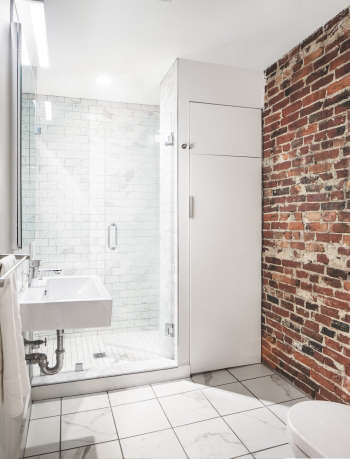
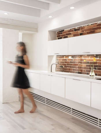
Welcome to the 21st century Myrtle! This was a very cramped, very dark garden level apartment in the Beacon Hill neighborhood of Boston. This became an archeological dig from the onset as wall locations just weren’t making sense. With a little digging we discovered an extra 70 square feet and a number of beautiful brick walls. We relocated the kitchen which freed up some extra space for much needed bedroom storage. Minimalist millwork and finishes counterbalance the unearthed wood, brick and steel detailing. Beaudry Contsruction freed up Myrtle just a bit more by creating another connection to the garden from the bedroom. This project owes it success to a daring and trusting client and a relentless, passionate builder.

(Visited 149 times, 1 visits today)
Photos: Matt Delphenich

LD1

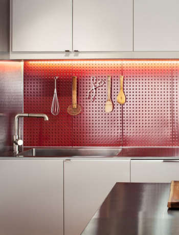
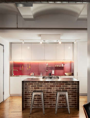
Phase 1 of this loft remodel saw the construction of a new kitchen for a Boston bachelor. The demands of work affords the client little time to prepare meals. Our design allows him to operate in the kitchen with efficiency. Frequently used cooking tools hang at the ready from a steel pegboard backsplash. He can add/ remove shelving, dish drying baskets, and cookting utensils as he pleases. A masculine palette of stainless steel counter, a brick half wall, and the red perforated steel recall the industrial past of this former textile factory.

From the client: “Chris is very detail-oriented and highly communicative (both pro-actively and on responsiveness). He is constantly trying to strike a balance among aesthetics, function and costs.”

(Visited 149 times, 1 visits today)
Photos: Matt Delphenich

W/U

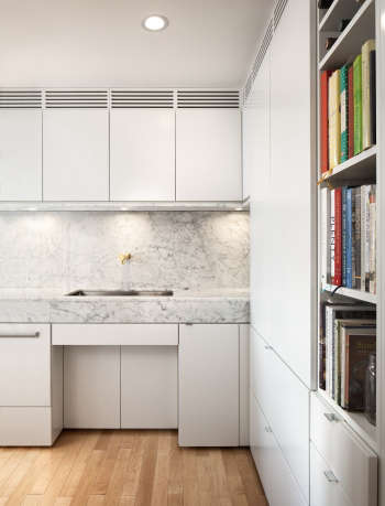
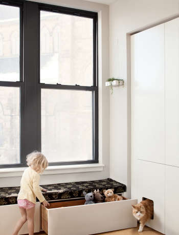
“Chris had a few really big challenges. The first is common to all city condos: square footage is tight and he had to maximize it. Chris also had to think about my wheelchair access, so I could do things around my own house. He had to think about the toddler, how we’d live happily with all her stuff, how we’d teach her orderliness in an open, shared space. And whatever he did with the kitchen had to please Elizabeth, who loves to cook and wanted a distinctive space to replace an ordinary one. . .You don’t walk into our home and think ‘gee, a disabled person lives here.’ It’s just, thanks to our work with Chris, a beautiful place that we can live in happily exactly as we are.”

(Visited 149 times, 1 visits today)
Photos: Matt Delphenich

Coverage on Remodelista & Gardenista

v5.0