Icon - Arrow LeftAn icon we use to indicate a rightwards action. Icon - Arrow RightAn icon we use to indicate a leftwards action. Icon - External LinkAn icon we use to indicate a button link is external. Icon - MessageThe icon we use to represent an email action. Icon - Down ChevronUsed to indicate a dropdown. Icon - CloseUsed to indicate a close action. Icon - Dropdown ArrowUsed to indicate a dropdown. Icon - Location PinUsed to showcase a location on a map. Icon - Zoom OutUsed to indicate a zoom out action on a map. Icon - Zoom InUsed to indicate a zoom in action on a map. Icon - SearchUsed to indicate a search action. Icon - EmailUsed to indicate an emai action. Icon - FacebookFacebooks brand mark for use in social sharing icons. flipboard Icon - InstagramInstagrams brand mark for use in social sharing icons. Icon - PinterestPinterests brand mark for use in social sharing icons. Icon - TwitterTwitters brand mark for use in social sharing icons. Icon - Check MarkA check mark for checkbox buttons.
Search

Delson or Sherman Architects

Brooklyn

Regions Served

  • New York City & Mid-Atlantic

DELSON or SHERMAN ARCHITECTS PC is a Brooklyn design firm founded in 1997 by Perla Delson and Jeff Sherman. The firm’s diverse portfolio combines clean, understated detail with careful space planning. We have a reputation for brilliant design, rigorous involvement during construction, and meticulous bid documents.

We are good listeners. More than working diligently to fulfill the needs of our clients, we see the design and construction process as inherently collaborative—with clients, with consultants, and with contractors. Our work benefits from our tactical deployment of budget, deliberate economies of gesture, and painstakingly detailed construction documents.

In place of a signature style, the firm focuses on the unique opportunities of each project. We address site-specific concerns with fresh ideas while incorporating proven solutions into new contexts. We value the sustainable restoration of old buildings.  But we also believe these can be gracefully bridged to the present with innovative additions. By coupling elegant modernism with traditional materials, our work has a sense of inevitability.  Our designs feel as though they have always belonged to the site.

(Visited 1 times, 1 visits today)

Details

Contact

Principals

  • Perla J. Delson and Jeffrey I. Sherman

Locations

  • 20 Jay Street Suite 636
    Brooklyn, NY 11201

Featured Projects

Greenpoint Row House

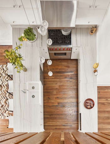
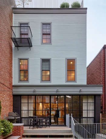
We had to convince the owners of this wood-framed row house to renovate rather than sell. (The structure was unstable, the facades were asbestos and vinyl siding, and the cellar flooded seasonally.) But now, they’re glad they did. Since the house is in Greenpoint’s landmark district, the front façade has a new period-perfect polychrome cornice at the top. In the middle are replicas of the original windows, casings, and clapboards. And at sidewalk level, an etched glass wall of windows gives luminous privacy. French doors in black steel open onto a new deck to the garden. A catwalk playroom overlooks the two-story kitchen at the heart of the house. The open riser stair is made from salvaged floor beams. Moreover, the wine cellar is bone dry.

(Visited 95 times, 1 visits today)
Photos: Nikolas Koenig

Park Slope Tudor

This Park Slope house plus garage had a layout so awkward the basement stair severed the small kitchen from the rest of the house. Moreover, it suffered from no storage and years of shoddy renovations. By reorienting the stair, the architect gave the kitchen room for multiple cooks and an eat-in island. She also added ample closets to a reorganized entry. A mod walnut wall frames a huge soapstone fireplace. With acoustical tiles removed at the kids’ rooms, cathedral ceilings now soar under the steep slate roof. Built-ins create cozy window seats and clever storage. The new master suite has large steel windows and a private roof deck. She wove traditional materials through the house in modern insertions.

(Visited 95 times, 1 visits today)
Photo: Brett Beyer

Brooklyn Heights Carriage House

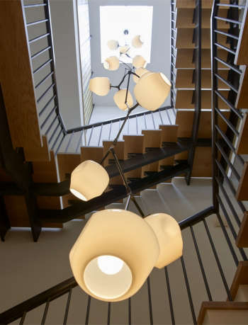
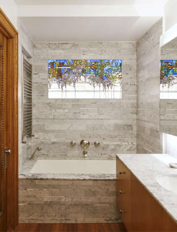
A developer had split this Brooklyn Heights carriage house down the middle before our clients bought the house on the left. We revived the industrial flavor and added elegant, modern details. A large skylight drops daylight through the center of the house, while a new steel and oak stair winds around a three-story pendant light. New steel windows evoke the building’s industrial past. And the rear garden and roof decks provide views to green on every floor. Our modern stained glass serves as a privacy screen for the master bath. Warm metal accents and light colored woods soften large rooms. A wall of cerused oak, for example, hides a powder room and kitchen storage.

(Visited 95 times, 1 visits today)
Photos: Jason Schmidt

Prospect Heights Addition

The Brooklyn architects nearly doubled the size and value of this little row house. Moreover, winning Landmarks approval set a precedent. With an additional floor at the rooftop and a two-story extension at the rear, this was the first big enlargement approved in Prospect Heights’ new historic district. The new top floor is all master suite with a private sun deck and a commanding view. The rear addition opens the living spaces to the backyard, while allowing for a large sunny kitchen. Finally, a new stair links new and old floors.

(Visited 95 times, 1 visits today)
Photo: Timothy Bell

Prospect Park West House

This proud row house faces Prospect Park, but its last owner had turned the building into chintzy B&B suites. To reorganize rooms to suit a growing family while preserving period details, the architects took a surgical approach to the design. They not only wove state-of-the-art building systems through the historic structure, but replicated the original stone, woodwork, and stained glass. New soapstone slabs and inlaid floors crisply contrast with old filigree for a striking new kitchen. A new outdoor stair connects two new roof decks.

(Visited 95 times, 1 visits today)
Photos: Jason Schmidt

Park Slope Renovation

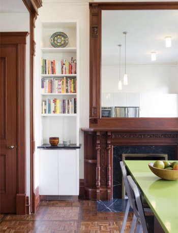
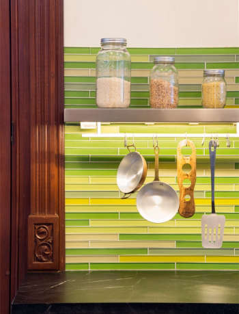
The owners assumed they’d have to enlarge this intact row house to fit their program. But their Brooklyn architects discovered so much wasted space that, once reconfigured, everything fit. Though they restored and re-created period details, the architects offset these with modern accents that allow for casual living. In the kitchen and dining room, minimalist cabinets and bright colors complement the dark wood moldings and restored parquet floor. The architects rebuilt the rotted rear extension to support a new deck for outdoor dining. To this, they added built-in planters and a stair to the garden. Upstairs, they designed a family room with colorful built-in shelves wired for TV and sound. This still left room for a full-size laundry to cut trips to the cellar. Upgrading the tenant flat, they added a shared vestibule and owner’s mudroom to the garden level.

(Visited 95 times, 1 visits today)
Photos: Brett Beyer

Industrial Conversion

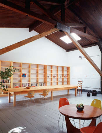
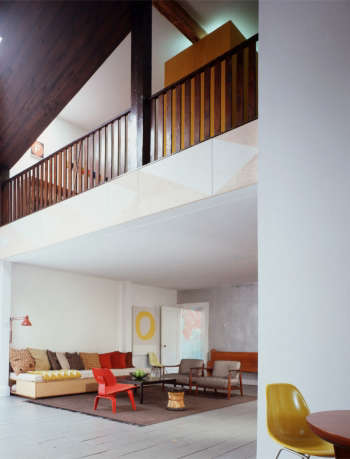
Before the Brooklyn architect converted this landmark-district building into a house, it was a church. And before that, a warehouse. She rebuilt the long exterior masonry wall, adding heavy timbers to stabilize the structure. By leaving these exposed, she kept the industrial character and basic plan of the house’s origins. Deep skylights now light the double-height space, which is furnished with a 20′ long table of fir planks. Lastly, small spaces on and under the choir loft make for cozy alternatives to the big room.

(Visited 95 times, 1 visits today)
Photos: Catherine Tighe

Park Slope Apartment Combination

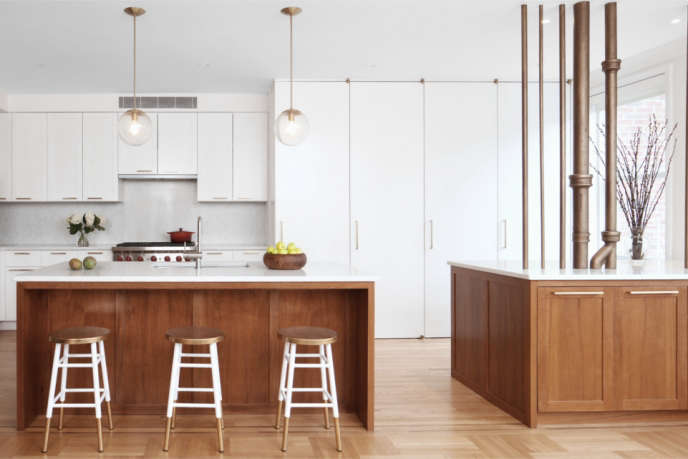
Apartment combinations should feel as if they’ve always been one coherent layout. Given the limitations of a pre-war high rises, this can be tricky. You have existing chases, risers, and columns, not to mention coop rules against wet spaces over dry. We managed to unify this layout by creating an axis of common spaces with daylight at both ends. Putting the family room at one extreme end of the unit and the living room at the other made the most of the new long view between them, resulting in common space that feels uncommonly spacious. The building’s infrastructure could have hobbled the layout. Instead, we exposed the column and pipes at the kitchen, adding character while screening the work zone. We also enlarged the kitchen and coat closets and added a foyer where once there was only a narrow hall.

(Visited 95 times, 1 visits today)
Photo: Maxime Poiblanc

Chelsea Loft

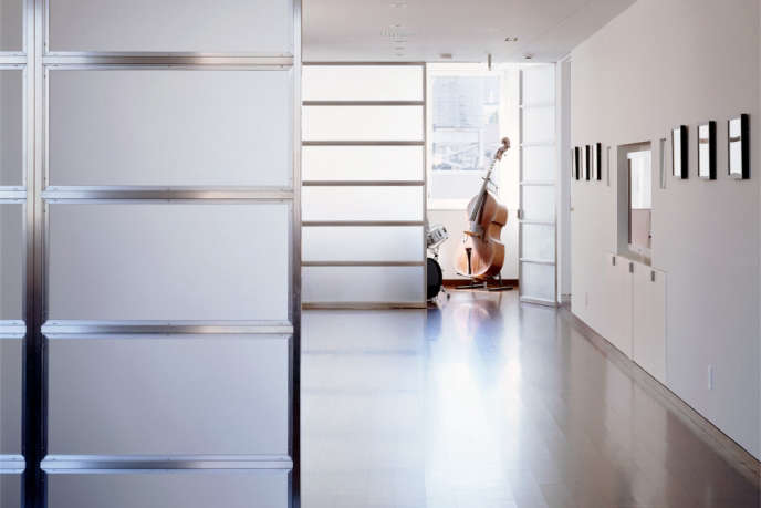
For really large loft renovations, size can be its own problem. This apartment’s huge footprint (5000 square feet) left its dark center awfully far from the perimeter windows. We fixed this by pushing the habitable rooms to the windows and conversely packing the middle with storage. Then we ran a ring of circulation between the two zones. Instead of side walls, the family room walls has giant etched-glass panels that pocket away so as to clear a path for the kids’ zip line. For the adults, there’s an acoustically isolated music room, a climate-controlled wine room, and minimalist detailing.

(Visited 95 times, 1 visits today)
Photo: Catherine Tighe

Soho Duplex

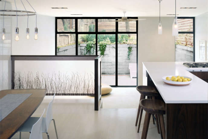
For this Soho residence, the New York architects combined two stacked apartments with a new rear extension. The resulting duplex expands as you move through it. Starting with a low entry, they gained ceiling height by dropping the floor of the rear extension. This further created multiple levels for gardens: a sunken terrace outside the living room, an arboreal backyard above, and a green roof off the master bedroom. The treads of the new stair cantilever from a bank of cabinets. And lastly, a chimney with indoor and outdoor fireplaces anchors the glass wall of the living room.

(Visited 95 times, 1 visits today)
Photo: Catherine Tighe

Coverage on Remodelista & Gardenista

v5.0