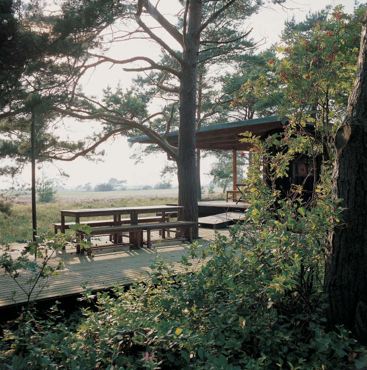
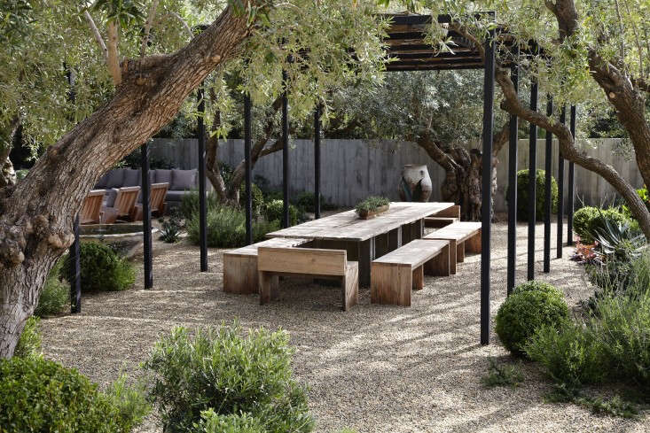
The Modernists of the past century were optimists. They believed that better gardens meant better living. They helped invent the idea of the friendly garden: a place to live in instead of to work.
In the post-war boom that spawned suburbia, even a postage-stamp lot had a backyard for lounging in as well as a front garden, and modernist landscape architects made the most of both. Patios, pools, and backyard grills all got a boost from simple, budget-friendly principles of mid-century garden design.
By simplifying and streamlining landscapes, modernist landscape designers lured homeowners to explore the possibilities of their outdoor spaces and, by extension, to appreciate nature. Decades later, contemporary gardens are still influenced in big and small ways by the modernist goal to annex the outdoors as living space.
Here are 10 garden ideas to steal from the modernists for your own landscape:
Restrained Palettes

Modernist landscape architect Thomas Church (inventor of the kidney-shaped swimming pool) believed that a simple planting scheme with a limited number of varieties would make maintenance easier.
Start with a strong garden design, and you can always go back later and add more plants if you want, Church believed.
Outdoor Living Rooms

See more of this garden in Architect Visit: A Modern Landscape for a Midcentury Remodel in Melbourne.
An idea that emanated strongly from mid-century California: Fling open the doors and windows so you can add the extra square footage of patios and courtyard into your living area. If you live in a colder climate, you won’t be able to do this year-round, of course. But so long as you use weather-resistant materials in an outdoor living space, it will stand up to the seasons year after year.
Sculptural Plants

Fewer plants means less work. The modernists replaced fussy flower beds that needed weeding and clipping and deadheading with well-placed, sculptural specimens.
It’s easy to borrow this idea for your own garden, especially if you have a no-maintenance gravel courtyard instead of a lawn. The natural colors of crushed stone will complement and emphasize the green-ness of foliage. A single large plant or three goes a long way.
Geometry

Modernist gardens relied on repetition of simple shapes—squares, rectangles, circles, and triangles—to create a sense of order. You can do the same: consider metal landscape edging to define a boundary or a tightly clipped shrub to create a soothing sphere.
See more in Hardscaping 101: Metal Landscape Edging.
Setting Boundaries

To make the most of limited space in suburban gardens, modernists demarcated it. Using shrubs and trees to mark boundaries, they divided a garden into distinct areas for dining, lounging, and play.
In a small garden, you can create different “rooms” with low-growing border plants or shrubs that divide the space without blocking your view.
Curves

“A curved line against a view presents the least irritation” to the eye as you seek a distant view, landscape architect Church believed. To that end, his California gardens had irregularly shaped patches of lawn, kidney-shaped swimming pools, and meandering paths.
Look at your land, where it rises and where it ebbs, and follow the undulations with your eye. If that’s a pleasing view, you can reinforce it with curves in paths, retaining walls, or other hardscape elements.
Seamless Connections

In Modernist gardens, the material underfoot—such as concrete or stone—was often a seamless continuation of the flooring used indoors. When the materials match, the spaces feel more connected.
Grid System

A repetitive, geometric pattern of grids is a hallmark of mid-20th century design. Modernist gardens have clean lines, sharp angles, and a clear demarcation of space as seen in the front garden shown above. See more of this garden in Architect Visit: A Modern Landscape for a Midcentury Remodel in Melbourne.
You can follow suit by laying out a garden on a grid, with boundaries for patios, paths, lawns, play areas, and entryways.
Budget-Friendly Hardscape

Case Study House No. 8, the prefab house that designers Charles and Ray Eames built for themselves in Los Angeles in the 1940s, became one of Modernism’s most iconic structures. The goal was for the house to fit into the landscape rather than to conquer the land: the original building plans were altered to preserve a meadow where the couple liked to picnic.
Follow the Eameses’ lead with hardscape (including patios, courtyards, paths, and entryways) built of natural materials such as wood, hone stone, small rocks, and bricks—to deepen the connection between indoor living spaces and the greater surrounding landscape.
See more of the Eameses’ garden and house at A Modern Garden: At Home with Charles and Ray Eames in California.
Personal Touches

People sometimes confuse modernist gardens with austere, hard-edged contemporary spaces that have too many shiny surfaces and sharp angles. But at the Eameses’ house, nature lived indoors as well as out and eclectic collections—of rocks and leaves and favorite houseplants—shared shelf space with books. As shown above, a drainage channel alongside the house’s foundation is home to a mismatched collection of container plants chosen for their pleasing idiosyncrasies. Ray Eames loved geraniums and flowering potted plants; she moved them around depending on what was in bloom.
N.B.: See our Garden Design 101 guides for more ideas for designing Decks & Patios, Exteriors & Facades, and Gravel Gardens. And see more of our favorite modernist gardens:
- 10 Garden Ideas to Steal from California.
- Great Garden Inventions: A Smithsonian Exhibit Traces the History of the Backyard.
- 10 Ideas to Steal from Suburban Gardens.
- Sleekness in Seattle: Modern Garden, Midcentury House.


Have a Question or Comment About This Post?
Join the conversation (0)