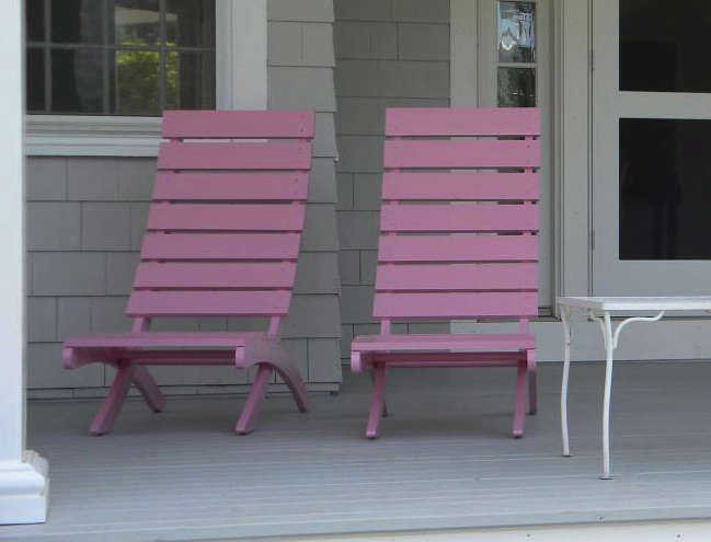
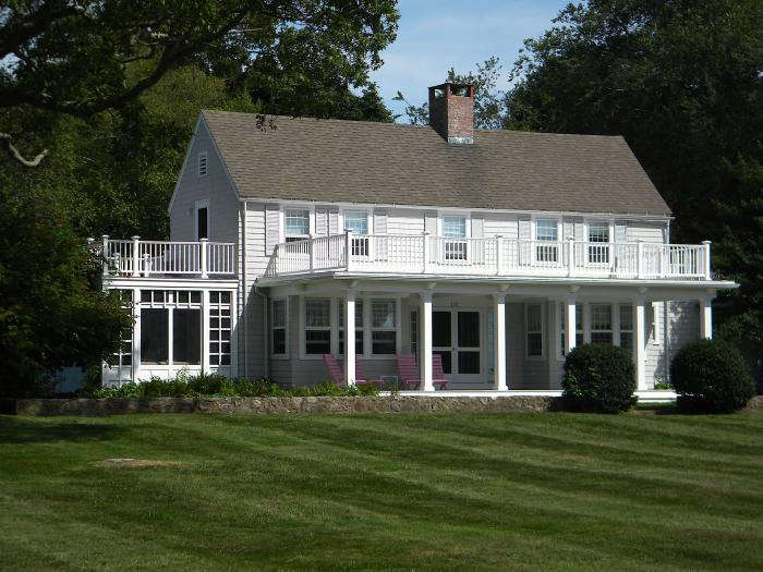
The summer of 2011, I painted my deck chairs pink. And so? My bold move was not as scandalous as the plot line of Herman Raucher’s coming-of-age film, “The Summer of ’42” (in which a recently widowed young bride seduces a teenage boy on Nantucket Island), but in the context of coastal Connecticut home design, my act was racy and divisive.
Or at least that’s how I interpreted a comment from an acquaintance in town. “Now, Christine, I haven’t driven by to see your pink chairs yet, but I have to tell you, they have been the talk of the summer. Some people love them, and others… Well, let’s just say they don’t.”
Here’s how I managed to start the big debate of the summer of ’11 in our sleepy, shoreline community. Care to weigh in?
Interested in seeing the less controversial decisions we made in our house remodel? See Minimal Moves for Maximum Impact in Christine’s Connecticut House.
Photography by Christine Chang Hanway.

Above: The chairs that caused a mild furore in the summer of ’11.

Above: The inspiration for my act of defiance? The previous summer, I spotted a matching pink door and flowers on this shingle house in Stonington, CT, a small historic New England fishing town.
Above: My favorite flowers are hydrangeas, and our house is surrounded with glorious hydrangea bushes of many different hues. While nothing says summer like hydrangeas, I also love the fact that they can be used throughout the year (see for yourself at Dried Hydrangeas, Two Ways). 
Above: I sourced these untreated cedar hardwood chairs on eBay and set about selecting a color that would complement our house–and our hydrangea bushes.
Above: I was seeking a soft pink to blend in with the hydrangeas and the background gray of the house, which is painted Benjamin Moore’s Stonington Gray. After several days of ruminating over Benjamin Moore pink paint cards, I selected Countryside Pink.

Above: I wanted my chairs on the porch to acknowledge sunshine, heat, and summer; the things we crave so dearly at this time of year. “When we see the pink chairs come out, we know it’s summer,” my supporters tell me. Tell us: what color would you have used in similar circumstances (and really, didn’t Lily Pulitzer popularize pink and green as a color palette)?
Commonly associated with Valentine’s Day, the color of “love” can be cloying and sweet. See 350 images of our favorite uses of Pink in our gallery of rooms and spaces and change your perspective forever.
This is an update of a post that originally ran on February 11, 2013 as part of our L’Amour issue.


Have a Question or Comment About This Post?
Join the conversation (0)