Icon - Arrow LeftAn icon we use to indicate a rightwards action. Icon - Arrow RightAn icon we use to indicate a leftwards action. Icon - External LinkAn icon we use to indicate a button link is external. Icon - MessageThe icon we use to represent an email action. Icon - Down ChevronUsed to indicate a dropdown. Icon - CloseUsed to indicate a close action. Icon - Dropdown ArrowUsed to indicate a dropdown. Icon - Location PinUsed to showcase a location on a map. Icon - Zoom OutUsed to indicate a zoom out action on a map. Icon - Zoom InUsed to indicate a zoom in action on a map. Icon - SearchUsed to indicate a search action. Icon - EmailUsed to indicate an emai action. Icon - FacebookFacebooks brand mark for use in social sharing icons. flipboard Icon - InstagramInstagrams brand mark for use in social sharing icons. Icon - PinterestPinterests brand mark for use in social sharing icons. Icon - TwitterTwitters brand mark for use in social sharing icons. Icon - Check MarkA check mark for checkbox buttons.
You are reading

Before & After: An “Ugly Duckling” Landscape Transformed, in NY’s Hudson Valley

Search

Before & After: An “Ugly Duckling” Landscape Transformed, in NY’s Hudson Valley

June 11, 2019

The first time Brooklyn-based architect Roberto Sosa and his partner, Jeffrey Coe, saw a circa-1880s farmhouse and garden in the Hudson Valley north of the city, the house was painted a bright sky shade of blue—and was “in desperate need of restoration, upgrades, and TLC,” says Sosa. It was a real “ugly duckling.”

It took the couple more than seven years to remodel the house and the sprawling grounds, barn, and gardens, where they created a series of outdoor rooms and a buffer from a nearby road. Ugly duckling no more:

N.B.: See the interiors of the farmhouse on Remodelista.

Photography by Mylene Pionilla, except where noted.

Before

Photograph by Jeffrey Coe.
Above: Photograph by Jeffrey Coe.

The previous owners of the house in Milan in northern Dutchess County had been in residence since the 1950s.

After

The front garden beds of a remodeled \1880s farmhouse are laid out to emphasize the symmetrical features of the facade.
Above: The front garden beds of a remodeled 1880s farmhouse are laid out to emphasize the symmetrical features of the facade.

For curb appeal, Sosa and Coe painted the farmhouse in “serene gray” (Benjamin Moore’s Platinum Gray) and replaced the front door with a salvaged Dutch door, adding an antique-style transom window above the entryway. The bluestone entry stoop is new and a few windows have been relocated to create symmetry.

Channeling the farmhouse&#8\2\17;s \19th-century roots, Sosa and Coe tackled the landscaping. &#8\2\20;The gardens were developed slowly as we defined what areas to use over time, and the best spots at different times of the day,&#8\2\2\1; Sosa says.
Above: Channeling the farmhouse’s 19th-century roots, Sosa and Coe tackled the landscaping. “The gardens were developed slowly as we defined what areas to use over time, and the best spots at different times of the day,” Sosa says.

For the front of the house, designed with local landscape designer Don Statham, the couple envisioned a garden that would be both “a buffer from the road and a viewing garden from the house,” and planted “a leaf hedge that encloses mostly white flowering species in two exterior rooms.” The loose hedge acts as a visual barrier while the flowering gardens are a focal point visible from inside the home; symmetry gives it a traditional feel.

Planted at the perimeter of the farmhouse, white hydrangea hedges provide privacy without a fuss.
Above: Planted at the perimeter of the farmhouse, white hydrangea hedges provide privacy without a fuss.

Sosa designed the other gardens himself and added a kitchen herb garden “built with bricks and stones dug out from the property.” With the addition of French doors to the kitchen/dining area, it’s now easily accessible in good weather.

The French doors look out to a newly installed raised bluestone patio, which acts as a second dining room in summer.
Above: The French doors look out to a newly installed raised bluestone patio, which acts as a second dining room in summer.
The path to the barn.
Above: The path to the barn.

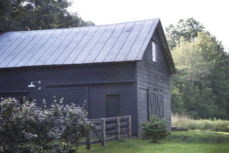
Another major challenge was renovating the barn; at the time the couple found it, it was full to the rafters with antiques and bric-a-brac. In the process of clearing it out, they discovered that some of the beams had likely come from the nearby branch of the Central New England Railroad, now dismantled. The couple rebuilt the doors, windows, and siding but left the roof intact: “It’s the original tin roof, the only part we did not replace,” says Sosa.

The couple painted the facades of the barn and shed in Sherwin Williams Greenblack.
Above: The couple painted the facades of the barn and shed in Sherwin Williams Greenblack.
 With a wooden split-rail fence, the couple stayed true to the barn&#8\2\17;s heritage.
Above: With a wooden split-rail fence, the couple stayed true to the barn’s heritage.
A hedge of ferns and hydrangea in the couple&#8\2\17;s all-white color scheme.
Above: A hedge of ferns and hydrangea in the couple’s all-white color scheme.

As residents of New York City during the work week, the couple had a few specific considerations when choosing plants: “We enjoy endemic, vigorous, low-maintenance species that thrive with limited weekend care,” Sosa says. Hydrangea were a perfect fit. Plus, “we have an abundant deer population, so plants were selected accordingly,” he says.

Wood and kindling, ready for winter fires, stay dry in a nook in the toolshed.
Above: Wood and kindling, ready for winter fires, stay dry in a nook in the toolshed.

For more of our favorite upstate gardens, see our posts:

(Visited 3,906 times, 9 visits today)
You need to login or register to view and manage your bookmarks.

Product summary  

Have a Question or Comment About This Post?

Join the conversation

v5.0