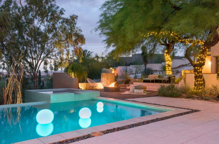
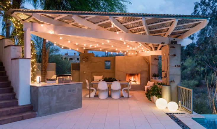
The winner of the 2017 Gardenista Considered Design Awards Best Hardscape project is Boxhill Design for their Desert Geometry project in Tucson, Arizona.
The project was chosen as a finalist by guest judge Deborah Needleman, who said: “This striking hardscape creates a sense of place.”
N.B. This is the fourth of eight posts spotlighting the winners of the 2017 Gardenista Considered Design Awards. Go to this year’s Considered Design Awards page to see all the entries, finalists, and winners, and to have a look at the Remodelista Considered Design Awards.
Photography by Matt Vacca.

Boxhill’s Design Statement: “A modern take on a traditional shade pergola and outdoor living space. Our hardscape design combines contemporary materials and clean architectural lines to create a covered veranda with a built-in fireplace, minimalist pool, and windowed walls to expose views of the city skyline.”

Q: What does your firm specialize in?
A: At our design firm Boxhill and our online design store ShopBoxhill.com, we specialize in creating landscapes that draw people outside and curating modern products for outdoor living.
Q: Who worked on the winning project?
A: Elizabeth Przygoda-Montgomery, principal designer of Boxhill Design.
Q: What were your practical goals for the project?
A: Working with a sloped, south-facing lot overlooking the Tucson skyline, we wanted to make the most of the view and create useable spaces for outdoor living. The site also needed more sun-cover for our clients to be able to sit outside and enjoy their yard.

Q: What solutions did you find to your design problems?
A: We worked with the natural slope of the lot to add tiered outdoor living areas and stair-stepping exterior walls. In an area with an outdoor lounge and fire pit, we dropped the height of the wall to open up views of the mountains and city skyline—it’s the perfect place to watch the sun go down. We also designed a contemporary covered veranda with angled beams radiating from a built-in fireplace. The veranda provides shade for the outdoor dining table during the day and a second inviting, fire-lit destination in the evening.
Q: What are your favorite features of the project?
A: The muted, cooling color palette. The desert sun can be so extreme that bright colors like red and orange can make a space feel hotter. We used a lot of cooling tones like grays and blues and light colors that almost make this landscape feel like it’s near the ocean. The muted color palette also highlights the subtle texture of the building materials—the brushed surface of raw concrete, dull metal of the roof, and small shells embedded in the floor tile.

Q: What advice do you have for someone else undertaking a similar project?
A: For any climate—but especially the desert—make note of the path of the sun while you’re mapping out your design. For this site, we had to be very conscious of where shade was needed based on where our clients might like to hang out at any point in the day.
Q: What was your biggest splurge?
A: The pavers were slightly pricey, but they were perfect for the site. They don’t hold heat and we loved that they had little pieces of seashells in them. They’re locally made by Artistic Pavers.
Q: Where did you cut corners?
A: We left an area of the side yard natural, planting natives and seeding wildflowers. This was a win-win—it saved our clients’ budget for other areas of the landscape and also helps support native pollinators.

Q: If your project was a celebrity, who would it be?
A: Gigi Hadid. She’s unpretentious, and this space has a laid-back barefoot luxury feel without being over the top. The designs are current and fresh. It’s just the type of place I’d like to get together with friends and enjoy an evening.
Q: What is your best secret design source?
A: I am a tile junkie. I love how I can kick up a space by adding accents of color and texture with tile. Here we did it with the pool tile and the kitchen tile backsplash, which isn’t pictured. Right now, I’m crushing on tile from Fireclay—it’s all handmade and they have some unusual shapes and glazes.
Q: What is your favorite local shop or garden nursery?
A: It’s tough to find outdoor furniture and living products that look contemporary and hold up to being outside year-round, particularly in our desert climate. A few years ago, I founded ShopBoxhill.com, an online shop open to the public stocked with our go-to products for clients. We have everything from outdoor furniture and a great selection of fire pits to accessories like outdoor rugs, lights, and planters.

Q: Where do you get your design inspiration?
A: I pull from the client, the natural contours and features of the site, and the architecture of the house. I aim to give a client the best version of themselves in their backyard.
Q: Which garden designers, gardeners, or landscape architects do you admire?
A: Ten Eyck Landscape.
Q: What is your next project?
A: We are currently working with the Ritz Carlton Residential Community doing some interesting work. I’m also excited about a lake house project in Missouri where we are redoing a 180-foot seawall as well as designing and installing a new front yard/backyard landscape.


Have a Question or Comment About This Post?
Join the conversation (0)