Hired by a young family to revive a double-fronted Victorian house in the St. Kilda East suburb of Melbourne, Clare Cousins Architects didn’t do the usual tearing down of interior walls and building out. “In contrast to contemporary, open-plan, box-on-the-back additions, the project involves a series of insertions woven into the fabric of the building,” Cousins explains. Translation: The majority of the house was preserved, and the spatial planning was “driven by the cellular logic of the Victorian house.” But rest assured, the results are far from fusty.
Photography by Shannon McGrath via Clare Cousins Architects.

Above: The owners wanted to better integrate the house and garden, which had been obscured by tall, sloping brick additions. The architects removed these “lean-tos” and made use of the mottled brick to build extensions on the north and south wings of the house, plus a courtyard. These wings stand in the footprint of the old additions; one of the wings contains the living quarters, and the other, the sleeping zones.

Above: The front of the house retains its original multicolored Victorian brickwork.

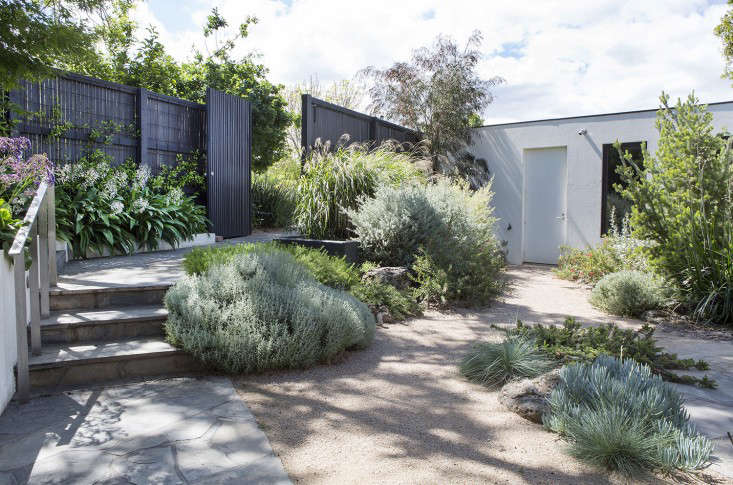
Above: The living area now has a direct link to the garden via a pop-out window and window seat. The decorative porthole windows–a request from the owners–send beams of early morning sun into the living room and kitchen. Landscape designer Fiona Brockhoff created the layered perimeter with an eye toward family-friendly plantings.

Above: What Cousins calls the “threshold space” between the house’s wings forms an indoor/outdoor dining area with pivoting glass doors. (For insulation, the windows in the house have double and low-e glazing.)
Above: The living area, with window seat and portholes. “Robust and economical materials were chosen for their familiarity, warmth, and ability to withstand the knocks of family life,” Cousins notes. The American oak Toto Stools are by Pierre + Charlotte. Read about the furniture company in Romance as Business: A Melbourne Design Duo. The wood-framed sofa is the Wilfred by Jardan of Melbourne.
Above: Classic bentwood chairs and, on the floor, the Block 2 Light by Sydney designer Henry Pilcher. (See the light used on the ceiling of a children’s room in A Textile Enthusiast at Home in Ann Arbor.)

Above: The dining room “introduces northern light deep into the plan and creates new opportunities for passive cross-ventilation,” Cousins says. Open to the living room, the space has a floor of concrete pavers laid in a herringbone pattern.

Above: A lounge off the kitchen is paneled with discreet storage cabinets. The light is the Gubi Grasshopper Floor Lamp by Swedish designer Greta Magnusson Grossman. For flexibility, the architects introduced sliding partitions between rooms in place of doors.

Above: A reminder of the house’s historic roots: an old-fashioned study for reading and playing music.

Above: A narrow space between the house and the property boundary was claimed to create a dressing area–a “walk-in robe” in Aussie speak–off the master bedroom. That’s the house’s original exterior brickwork.

Above: The dressing room and master bath are linked by Honeycomb Hex cement tiles made in Marrakech from Popham Design. The architects introduced a rainwater tank for toilet flushing and garden irrigation, and the hot water is solar heated.
Above: A floor plan of the remodeled house details the masterful weaving of existing and new elements, and the integration of interior and exterior.
See more Victorian remodels,see:
- Before & After: A Music Studio Rises from Its Victorian Ruins.
- Curb Appeal: Black and White Mosaic Tile in London.
- Saving the Hippie Soul of an Victorian House.
- Tailor-Made: A Victorian Remodel in Melbourne.


Have a Question or Comment About This Post?
Join the conversation