Orange is not my favorite color. I think that’s because it tends to scream for attention.
That said, there are times when orange is a good paint color to use. Putting it on a front door is good, for instance, because that’s a spot where it’s contained. And surprising. And more modern than red.
With Halloween approaching, orange is in the air. So I spent some time last week playing with different shades of orange paint for a front door. (Be warned: you have to be very careful to make sure the other paint colors on your house will work with orange. See below for some do’s and don’ts.)
Here are the eight best shades of orange to paint a front door:
Photography by Michelle Slatalla.

Above: From top to bottom, eight orange paint colors for a front door. Pratt & Lambert’s Painted Lady; Benjamin Moore’s Golden Gate; Benjamin Moore’s Topaz; Benjamin Moore’s Autumn Cover; Farrow & Ball’s Charlotte’s Locks; Pratt & Lambert’s Bittersweet; Benjamin Moore’s Montana Agate, and Benjamin Moore’s Audubon Russet.

Above: Orange is a warm color. That’s why you want to pair it with a cool color–white, off-white, blue, blue-gray, or blue-green–for best effect.
Blue, blue, blue: The reason orange looks good with blue is because the two are opposites on the color wheel. (That’s why your favorite orange sweater looks best with your blue jeans.)
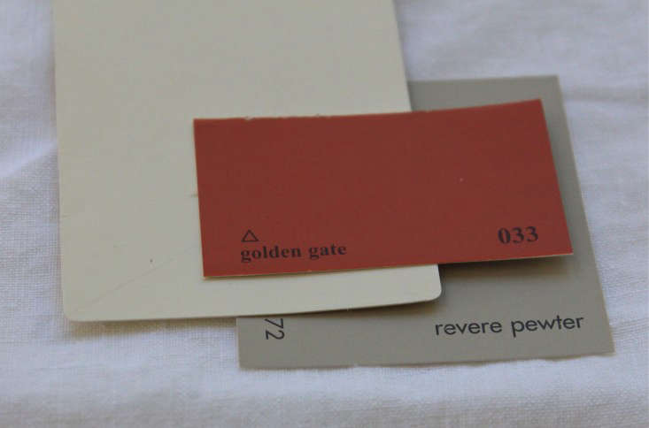
Above: Do, do, do. Here’s a trio of Benjamin Moore colors that works well as an exterior paint palette. Revere Pewter is a gray with a little green in it. Add trim painted in Mascarpone (a creamy and cheerful off-white) and you will have a nice backdrop for a front door painted with Golden Gate.
Remember: When you paint a door, you paint only the door. The trim around the door should match the color of the rest of the trim on a facade.
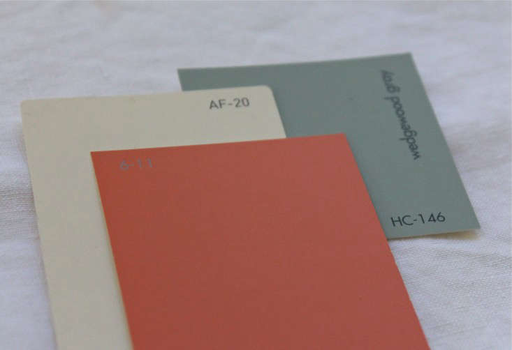
Above: If you have a darker gray paint on the facade like, say, Benjamin Moore’s Wedgewood Gray, you can go a little brighter with the orange door. See how well Pratt & Lambert’s Painted Lady plays off the gray here?
Above: If you prefer a light body with dark trim, Benjamin Moore’s Muslin paired with green-gray Knoxville Gray trim will work well with Golden Gate.
Above: A dark orange shade can be trickier. You don’t want it to suck all the life out of your house. Here Benjamin Moore’s Topaz would look handsome on a door paired a very light-colored body paint (Benjamin Moore’s Palace Pearl) and cheery Mascarpone on the trim.
Above: As for the don’ts? Oranges paired with golds or browns can look awful. That’s because golds and browns are also warm colors. Here Topaz with Benjamin Moore’s Dorset Gold is enough to rob you of the will to live. Even Mascarpone on the trim can’t rescue this paint palette.

Above: I spent a few hours testing colors in the name of finding happy pairings for orange paints. A few rules of thumb:
- If you’re pairing orange with blue or gray, you’re headed in the right direction.
- If you’re pairing orange with green, make sure it’s a cool green (with more blue than yellow in its undertones).
- If you’re pairing orange with brown or gold, you’re asking for trouble.

Above: And finally, when picking an orange paint for your front door remember that oranges with red undertones are easier to pair with other colors than oranges with yellow undertones. They’re just warmer. This week I tried to include a range of picks. But my three favorites–Golden Gate, Painted Lady, and Autumn Cover–all had a lot of red in them and made friends more easily than the yellow-oranges.
Painting your house? For more paint palettes, see Curb Appeal: A Perfect Paint Palette for a Dark Facade. And see the paints architects pick most for Black, White, and Gray facades.
Want to create Halloween curb appeal with a less permanent touch of orange? See 13 Ways to Add Instant Cub Appeal with Pumpkins.


Have a Question or Comment About This Post?
Join the conversation (3)