Icon - Arrow LeftAn icon we use to indicate a rightwards action. Icon - Arrow RightAn icon we use to indicate a leftwards action. Icon - External LinkAn icon we use to indicate a button link is external. Icon - MessageThe icon we use to represent an email action. Icon - Down ChevronUsed to indicate a dropdown. Icon - CloseUsed to indicate a close action. Icon - Dropdown ArrowUsed to indicate a dropdown. Icon - Location PinUsed to showcase a location on a map. Icon - Zoom OutUsed to indicate a zoom out action on a map. Icon - Zoom InUsed to indicate a zoom in action on a map. Icon - SearchUsed to indicate a search action. Icon - EmailUsed to indicate an emai action. Icon - FacebookFacebooks brand mark for use in social sharing icons. flipboard Icon - InstagramInstagrams brand mark for use in social sharing icons. Icon - PinterestPinterests brand mark for use in social sharing icons. Icon - TwitterTwitters brand mark for use in social sharing icons. Icon - Check MarkA check mark for checkbox buttons.
You are reading

Trending on Remodelista: 5 Design Ideas to Steal for Your Apartment

Search

Trending on Remodelista: 5 Design Ideas to Steal for Your Apartment

March 23, 2018

If you’re a renter, you don’t want to spend a lot of money on apartment upgrades that won’t be permanent. But chances are you’d like the space to feel bigger and brighter. The solution? Invest in a fresh coat of paint, airy furnishings (like a “first” sofa that won’t break the bank), and more design tricks the Remodelista editors investigated this week.

Plywood Pegboard
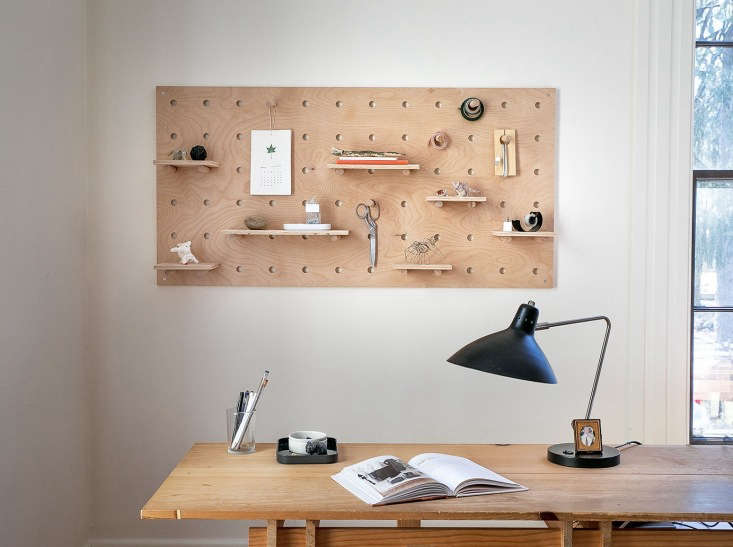
Justine&#8\2\17;s husband, Chad, made the ultimate gesture of love. He built her a custom plywood pegboard. Photograph by Justine Hand.
Above: Justine’s husband, Chad, made the ultimate gesture of love. He built her a custom plywood pegboard. Photograph by Justine Hand.

“Without directions or guidelines, designing and executing a pegboard so that everything lines up cleanly takes a lot of thought. Fortunately, my husband has done the work for you,” writes Justine. See more in this week’s DIY post.

“First Sofas”

Above: “When you’re moving on from Ikea but not ready to invest in the ultimate dream sofa, something straightforward, modern but comfortable, and versatile works best for your first ‘real’ sofa,” writes Alexa.

See our favorite classic sofas under $3,000 in this week’s 10 Easy Pieces post.

Neutral Paint Colors

Photograph by Mel Walbridge.
Above: Photograph by Mel Walbridge.

“Among the benefits of cool-toned whites paints: They have more dimension than a ‘pure’ white and make walls and ceilings recede more than warm whites do (making spaces feel bigger),” writes contributor Eleanor McCole.

See Architects’ 8 Favorite Cool-Toned Neutral Paints in this week’s Paints & Palettes post.

Transparent Teacups

Meredith has been steeping herself in &#8\2\20;the rich tea culture celebrated by Persians (and others) and the trappings that go along with it: the samovar (a sort of double-boiler teapot with separate chambers for hot water and concentrated tea), the cardamom-inflected black tea blend that steeps inside, and the teacups, which are always glass.&#8\2\2\1;
Above: Meredith has been steeping herself in “the rich tea culture celebrated by Persians (and others) and the trappings that go along with it: the samovar (a sort of double-boiler teapot with separate chambers for hot water and concentrated tea), the cardamom-inflected black tea blend that steeps inside, and the teacups, which are always glass.”

Why clear glass? “Because the tea drinker mixes water and tea from the samovar to her liking—and she’ll know she has it right by checking her glass,” says Meredith.

See more see-through choices in this week’s 10 Easy Pieces post.

Art Walls

Brooklyn-based gallery owner Sandeep Salter knows a thing or two about how to hang an art wall. Photograph by Jonathan Pilkington, styling by Alexa Hotz.
Above: Brooklyn-based gallery owner Sandeep Salter knows a thing or two about how to hang an art wall. Photograph by Jonathan Pilkington, styling by Alexa Hotz.

“Always frame an artwork for the artwork, not for its surrounding environment. The artwork will fit into an interior much better if it’s not trying to match it, but reflects something about the space or its inhabitants,” says Salter. See more at A Modern Fairytale Told in 800 Square Feet: Sandeep Salter’s Family Apartment.

(Visited 213 times, 1 visits today)
You need to login or register to view and manage your bookmarks.

Have a Question or Comment About This Post?

Join the conversation

v5.0